
Website


Thread Starter
Former Sponsor
Joined: May 2003
Posts: 4,334
Likes: 0
From: blackpool
who would like to,....if you get bored enough....
tho jazz up my website, nd make it more professional looking.
I have had a good go, but think its definately missing something...
and dont get the time to do more myself.
Thankyou pliz...
also, if you have a look, id appreciate opinions..
carl
tho jazz up my website, nd make it more professional looking.
I have had a good go, but think its definately missing something...
and dont get the time to do more myself.
Thankyou pliz...
also, if you have a look, id appreciate opinions..
carl
Thread Starter
Former Sponsor
Joined: May 2003
Posts: 4,334
Likes: 0
From: blackpool
cheers sludge....
wasnt really a plug, but van see how it would be viewed as that
a pal of mine had been on it, and said it was dull
so wondered if someone who has more experience in this field to give me some advice on how to make it, well, less dull
carl
wasnt really a plug, but van see how it would be viewed as that
a pal of mine had been on it, and said it was dull
so wondered if someone who has more experience in this field to give me some advice on how to make it, well, less dull
carl

No1 Blower.
Joined: Jul 2004
Posts: 6,738
Likes: 0
From: Milton Keynes
Originally Posted by G.B Turbo Solutions
cheers sludge....
wasnt really a plug, but van see how it would be viewed as that
a pal of mine had been on it, and said it was dull
so wondered if someone who has more experience in this field to give me some advice on how to make it, well, less dull
carl
wasnt really a plug, but van see how it would be viewed as that
a pal of mine had been on it, and said it was dull
so wondered if someone who has more experience in this field to give me some advice on how to make it, well, less dull
carl

garibaldi
Joined: Apr 2004
Posts: 8,294
Likes: 1
From: Wednesbury
I think its okay fella to be fair. Theres a few things i'd change tho.
1. Make your header the same width to fit up to the edge of the grey area instead of an inch gap ether side
2. Change the red writing for orange ie (home, warrenty etc)
Contact email address id change to white
and seeing as you have no customer cars yet, please feel free to donate and fit a T35 LOL
1. Make your header the same width to fit up to the edge of the grey area instead of an inch gap ether side
2. Change the red writing for orange ie (home, warrenty etc)
Contact email address id change to white
and seeing as you have no customer cars yet, please feel free to donate and fit a T35 LOL

PassionFord Post Whore!!
Joined: May 2003
Posts: 9,076
Likes: 0
From: Northants
Why are you using an org.uk domain - you're not a non-profit organisation, plus the .co.uk domain seems to be available.
You might also want to consider using the domain name for your email address (e.g. enquiries@gbturbosolutions.whatever) you should be able to forward emails to your Tiscali account, but this will depend on your domain registration company....
I'd lose the page counter, or look for an 'invisible' one if available.
Try to get some more information on there - maybe expand on your 32 point inspection? Turbo fault diagnosis chart etc.. give people a reason to visit your site, and get that professional feeling - good, quality content is the no.1 thing for a site, in the main.
Check your spellings.
Lose the badger comment at the bottom of the page - yes it's funny as I 'know' you from here, but it isn't 'professional.'
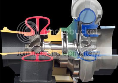
Optimise the turbo cutaway image - it's 83KB!
Spot the difference:

Header - same as Sludge said, but optimise it too - the file size is larger than it needs to be.
Spot the difference:


All meant constructively, as per your post.
You might also want to consider using the domain name for your email address (e.g. enquiries@gbturbosolutions.whatever) you should be able to forward emails to your Tiscali account, but this will depend on your domain registration company....
I'd lose the page counter, or look for an 'invisible' one if available.
Try to get some more information on there - maybe expand on your 32 point inspection? Turbo fault diagnosis chart etc.. give people a reason to visit your site, and get that professional feeling - good, quality content is the no.1 thing for a site, in the main.
Check your spellings.
Lose the badger comment at the bottom of the page - yes it's funny as I 'know' you from here, but it isn't 'professional.'
Optimise the turbo cutaway image - it's 83KB!
Spot the difference:
Header - same as Sludge said, but optimise it too - the file size is larger than it needs to be.
Spot the difference:
All meant constructively, as per your post.
Thread Starter
Former Sponsor
Joined: May 2003
Posts: 4,334
Likes: 0
From: blackpool
thanks sludge,
and thanks very much billabong
comments have been taken on board and the placement of changes will begin tomorrow as i have a spare 1/2 hour....lol
thanks again for the comments,
carl
and thanks very much billabong
comments have been taken on board and the placement of changes will begin tomorrow as i have a spare 1/2 hour....lol
thanks again for the comments,
carl
Trending Topics


had a loook
i can se the others points of views but they are "professional" website types
me, as a normal punter, sees different colours for the writing as being a little off putting jumping form pages to page
also, the main page has a few little banners at the bottom, maybe they can be a little bigger so we can see what you are offering?
don't know about the badger comment, to me it shows that you can have a little joke, but others have pointed out that you may not be taken as seriously
the bit about dougs motor is ok

I'm sure I could cobble something together for you
Take a look at my current efforts:
www.bluecossie.com
www.rsnorfolk.co.uk
Take a look at my current efforts:
www.bluecossie.com
www.rsnorfolk.co.uk
S1 Database Editor
Joined: Apr 2004
Posts: 6,492
Likes: 8
From: Lincolnshire
Originally Posted by the sludge
1. Make your header the same width to fit up to the edge of the grey area instead of an inch gap ether side
Simple white-on-black or black-on-white colours for writing make websites easier to read. Altho to be fair there isn't a vast amount of technical information on each page with a small font so that's not too much of a problem.
Maybe some more photos of your car: give the car its own page with tech spec and photos showing what work you've carried out. Can you also get a better photo cutaway turbo? The graphic doesn't quite look right.
also pictures under the different services you provide, but i think thats been mentioned before
it's quite nice and simple as it is so it just needs a few tweaks here and there
unles you want an all singing all dancing site it's fine for the moment
if/when you get real big then think about changing up
it's quite nice and simple as it is so it just needs a few tweaks here and there
unles you want an all singing all dancing site it's fine for the moment
if/when you get real big then think about changing up
Thread Starter
Former Sponsor
Joined: May 2003
Posts: 4,334
Likes: 0
From: blackpool
dojj....
thats a very sensible comment....
and it also means i can leave it and not put my "pf time" into the site

there will be a few very subtle changes, but hardly noticeable me thinks
just a few to make load quicker would be a good start
cheers bill
thanks again to the people that took the time to have a gander and give comments......all five of you.......
carl
thats a very sensible comment....
and it also means i can leave it and not put my "pf time" into the site
there will be a few very subtle changes, but hardly noticeable me thinks
just a few to make load quicker would be a good start
cheers bill
thanks again to the people that took the time to have a gander and give comments......all five of you.......
carl

Thread
Thread Starter
Forum
Replies
Last Post
DAN@ADRIAN FLUX
General Car Related Discussion.
37
Sep 20, 2015 10:38 AM
stu21t
General Car Related Discussion.
14
Aug 26, 2015 07:06 PM